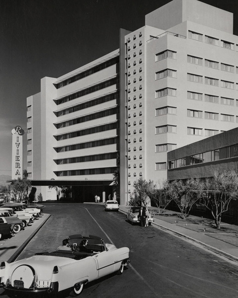
The Riviera Hotel Original Entrance
When I was a kid, Life Magazine published a weekly magazine. They employed some great photographers as well as good writers.
Life Magazine went the way of the dinosaur and the buffalo but its wonderful photo archive has been preserved thanks to a partnership with Google.
Here is what the entrance to the Riviera looked like in 1955 (Gotta love that mid-century modern facade and don't you wish it still looked like that today):

I have recently done a major cleaning of my office and discovered a box (put away for safe keeping, no doubt) that is filled with slides, postcards, old magazines, etc.
After the first of the year, I will start scanning them and add them to the blog. I htink you will enoy them.
In the meantime, I will be adding more photos from the Life/Google Photo Archive until the end of the year, so check back for updates.
For more history on the Riviera Hotel check out this link:
http://classiclasvegas.squarespace.com/a-brief-history-of-the-strip/?currentPage=21


Reader Comments (1)
For some reason, the entrance and porte cochere mto the Riv always struck me as the height of elegance and class, even at a young age. I truly mourned when they began to alter the front...after they removed the olive trees it was all over.
Of course the same thing happened at the Flamingo, and, worst of all, the glorious Tropicana.
Gosh, even the Hacienda looks classy in retrospect!
Keep up the good work